ANTANZEN
BOOK DESIGN AND LAYOUT
As part of my master thesis "ANTANZEN [ Tanztreff an der Postpassage ]", I placed a significant focus on the layout and design of the book. It conveys a certain feeling and tells a story to the viewer. With its concept and structure, it guides the reader through the project and creates an exciting reading experience.
THE BASE
The book has a custom format with a height of 24 cm, a width of 19 cm, and a thickness of 1.5 cm. Printed on 70 g recycled paper, it is thread-stitched with an open spine to ensure you can fully open it to properly view double-page spreads. The softcover comes on 120 g recycled paper, which is printed and matte foiled.
COLOURS
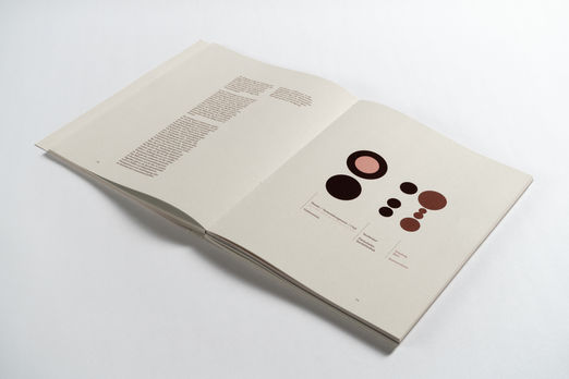
The warm and playful color scheme creates a welcoming atmosphere, which aligns with the theme of the master's thesis: to create a new dance space and support performative arts in Graz. The tone of the paper and the stitching thread match the color scheme, creating a cohesive look. The subtle dark spots that appear on the recycled paper contribute to a visual aesthetic that complements the graphics and images inside the book.
COVER AND BOX
The book cover is kept very simple but unique in the details! It is only printed on the red parts, so that the text and vector graphics show through in the form of recycled paper. The front simply displays the title, which is placed very thoughtfully, while the back features a “dancing line” that guides the viewer's eye to the book's spine, where the line continues in the form of the title. This is the visible part when the book is placed inside its protective box. The box is also covered with recycled paper, creating the perfect contrast with the colored book spine.
LAYOUT
The content consists of several larger sections, which are separated by fully colored double pages that introduce the next chapter. Within these sections, there is an excursus chapter, which is distinguished by different colors in the layout.
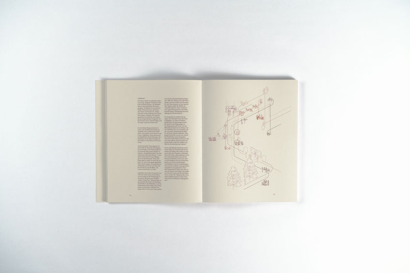
Text parts are structured with two columns to ensure a good reading flow, further supported by the chosen text fonts. Footnotes appear in a third column on the outside of the page, which is slightly narrower than the running text columns. Pictures within the text parts are integrated into the structure or presented over several pages.
Plans are always placed on the right page or as double-page spreads. Plan-related information is consistently arranged on the left page. This aids readers' orientation and directs their focus to the plan content.
You can view some of the book's graphics .
If you want to read the whole book on screen, you can download a pdf file or view it .
At the library of the KOEN Institute at the TU Graz, you can view a printed copy of the book. Find more information about KOEN .


